Color psychology and its best practices in UI/UX design
Color has an essential role in the visual experience. It is a powerful information medium for human cognitive ability. For instance, when encountering new things, color is the most specific element to notice and remember. Choosing and placing suitable colors in a product can lead to a positive feeling and behavior for the audience. However, color placement might be tricky, as each color possesses physiological and psychological properties differently. The cultural association where different colors have their meaning differs from one place to another.
Color is an influential part of UI/UX design. According to research by Colorcom, people take only 90 seconds to make subconscious judgments about a product, whereas almost 90% of the consideration is the color alone. The proper selection of colors can help optimize the user’s desired action and the effectiveness of a task. Psychological aspects, stereotypes, and cultural background should be considered before designing — transferring ideas, goals, and mood of the digital product.
This article will help you better understand the psychology of colors for a digital designer. Additionally, it includes best practices of color application in digital products and brands in general. At the end of this article, we also give hints of the latest UI/UX color trend. Keep reading!
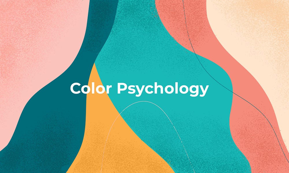
Color Psychology
Warm and Cool Colors
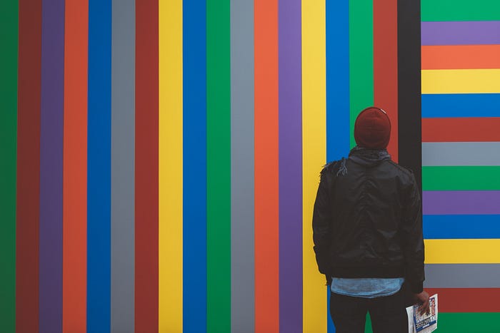
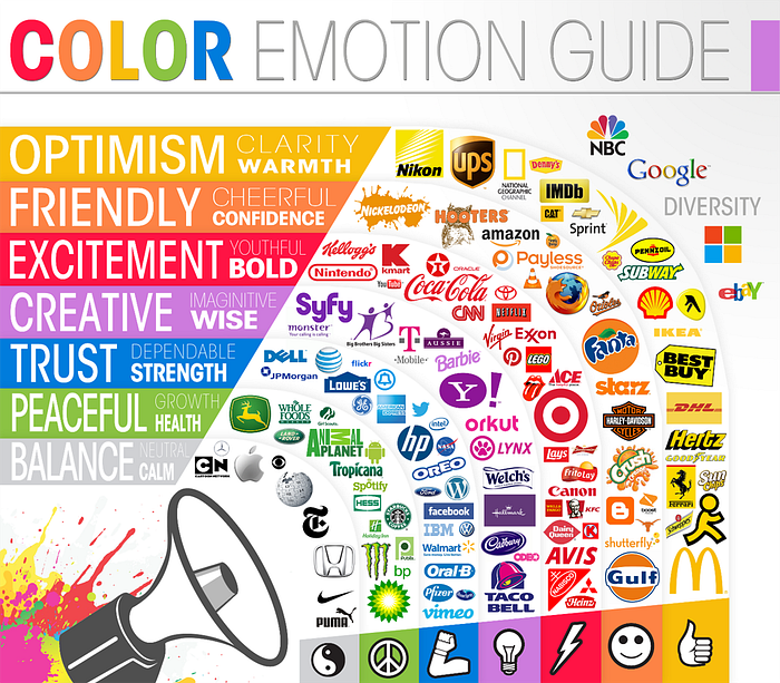
The general idea of color psychology is a split between warm and cool colors. Red, orange, and yellow are warm colors. These colors evoke emotions from feelings of passion and energy to anger and hostility. Meanwhile, blue, green, and purple are cool colors. These colors build a soothing sensation of nature, yet sometimes can also draw sadness and empathy.

Emotions of Color
In psychology, colors own strong relations with emotions associated with human cognitive units, often unconsciously. Red, for example, will quickly catch our eyes as it’s strongly related to blood. Thus, this color often uses to draw situations such as danger, warning, error, anything needed special attention. Usually, red also uses to draw spirit and excitement. In comparison, green is related to nature, composure, and hope. Psychologists classified colors into two categories: cool and warm that can be seen below. However, the perception between warm and cool is relative to the individual level. One’s experience of color can be in contrast to someone else.
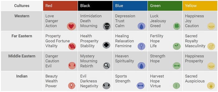
Color & Culture association
Understanding color and culture associations help the designer better understand their target user before deciding their color palettes for them to use. There are social contradictions of the meaning of colors and their association with the culture. For example, in Western culture, yellow is associated with happiness and joy. In contrast, in Indonesia, it is associated with grief and death as anytime there is a funeral, a yellow flag is placed around the neighborhood. Such a fact indicate challenges for brand aiming for the global market.
Color Perception Table
Understanding what colors mean is essential when designing a digital product. Color helps convey the right tone, better deliver the message, and encourage users to do the desired action. Here are lists of meanings of some popular colors commonly used in digital design.
Each individual’s perception might be different, but as society becomes more globalized, popular interpretations of color and its relation with emotion and the human mind start to appear and get its psychological legitimation through research.

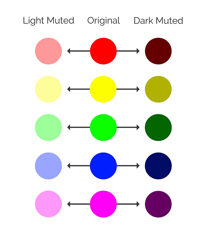
Muted Colors: 2021 UI/UX Trend
Lately, muted color palettes have taken over the digital design trend and seem to continue next year. It is vivid colors that have their edge taken off with an immersion of black, white, or a complementary color. This color draws a more relaxed and understated mood than the bright or ‘original’ color palettes. People seem to prefer muted colors as calming visuals, especially with so many confusing and loud sea of visuals during the hype of digital transformation.
Conclusion
Designing interfaces is not only about creativity. It is an act of offering solutions to the user in the form of a product that will make their life easier and happier. Colors have tremendous power to create an efficient user-centered design. In terms of color selection and usage in UI/UX design, a designer should always remember that, above all, the digital product’s interface should be usable and clear. Therefore, all the smallest aspects of color choices should be aiming to increase usability, utility, and harmony of the whole product.
***
Looking for the right partner for your digital transformation? Let’s talk or visit Glovory.com now!
Contributor: Rachmadita Kusumastiti